Bar Graph-RRB
Bar Graph
This is a type of graph in which the values are represented in the form of stacks or bars.
These bars or stacks can represent one or more series in the same graph.A bar graph may be either horizontal or vertical. To differentiate between the two,a vertical bar graph is called a column graph. An important point about bar graphs is that the length of the graph is proportional to its value: the greater the length, the greater the value.
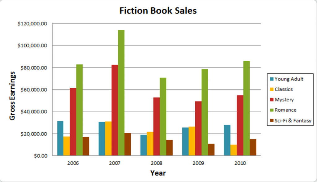
The category axis or the x-axis shows the categories being compared and the y-axis shows a discrete value corresponding to each category. Some bar graphs show data in clustered groups over a period and in others, the bar is divided into smaller parts to show cumulative effect. The latter kind of bar graphs are called Stack Graphs.
Note that in the legend to the bar graph, all the categories need not have a separate color or pattern of shading, yet the students are expected to make use of the sequence in which the categories are mentioned in the legend and in the actual Bar Graph, in order to interpret the data correctly.
Components of a bar graph:
A bar graph has the following components. (Refer to the graph given below for illustration)
Chart title:
It is present at the top of the graph and indicates what is graph is about. In the given graph,the chart title is ‘Number of boys and girls in 3 sections of a class’
Axes:
These are the two perpendicular lines labeled like number lines.The horizontal axis is called the x-axis. The vertical axis is called the y-axis. Both the axes contain labels that are used to read the values. In the graph below, tile x-axis has A,B and C while the Y axis has numbers as labels.
Axes titles:
These are the titles of the axes. In the given graph, the x-axis title is ‘Sections’ and the y-axis titleis ‘Number of students’.
Grid lines:
These are the lines that extend from horizontal or vertical axes across the plot area of the chart. They improve the readability of the graph. Grid lines are of two types:
i) Major grid lines: These are the grid lines marked parallel to the labels.In the graph below,the darker lines parallel to the x-axis are the major grid lines.
ii) Minor grid lines: These are the thinner grid lines between the major grid-lines. These are for the precise reading of the graph. In the graph below, the lighter lines parallel to the x-axis are the minor grid lines.
Legend:
Data are represented by multiple colors or textures. Legend explains what a particular color or texture represents. In the below graph, the legend tells us that boys are represented by blue while girls are represented by orange color.
How to Read a bar graph?
A bar graph is read using the grid lines. Observe the tip of the graph.
Value of bar = value or preceding major grid line + N x width of minor grid line Where N represents the number of the minor grid line which touches the bar. Let’s take the above graph.
Here the width of a major grid line is 5 and there are 5 minor grid lines between two successive major grid lines.Hence the Width of minor grid line = 1
Suppose we have to calculate the number of boys in section A
The preceding major grid line is at 30.There are 2 minor grid lines aner that. Hence the value is 30 + 2 = 32
Types of bar graphs:
Bar graphs are of the following types
Vertical bar graph:
Also called column graph.In these graphs, the x-axis shows the categories being compared and the y-axis shows a discrete value corresponding to each category.
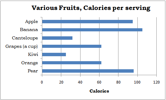
Horizontal bar graph:
It is the axis reversal of the vertical graph. In these graphs,the y-axis shows the categories and the x-axis shows the value corresponding to the category.
Stack bar graph:
A stacked bar graph represents data sets on top of each other.The height of the resulting bar shows the combined result of the data sets. However, stacked bar charts are not suited to data sets where some groups have negative values.
There are two types of Stacked Bar Graphs:
Simple Stacked Bar Graphs:
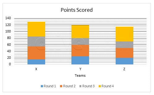
such graphs the value for the segment Is placed after the previous one. The total value of the bar is all the segment values added together.
I. The following bar graph shows the total number of persons participating in a survey from 5 different countries in year 2016. Study the graph and answer the questions that follows:
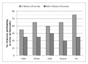
Q1. What is the average number of persons who are in favour of survey?
(a) 66,000
(b) 64,000
(c) 62,500
(d) 68,450
(e) 74,250
Ans. (a) 66,000
Q2. From which country, maximum number of persons have participated in survey?
(a) India
(b) UK
(c) Russia
(d) China
(e) USA
Ans. (b) UK
Q3. The number of persons in favour of survey from India are what percent of number of persons in favour of survey from USA?
(a) 92%
(b) 95%
(c) 87.5%
(d) 82.5%
(e) 88.25%
Ans. (c) 87.5%
Q4. The number of persons not in favour of survey from China are what per cent more or less than the number of persons not in favour of survey from Russia?
(a) 20% less
(b) 20% more
(c) 25% less
(d) 25% more
(e) 30% more
Ans. (d) 25% more
Q5. What is the ratio of number of persons in favour of survey from India and Russia together to the number of persons in favour of survey from China and UK together?
(a) 4 : 5
(b) 5 : 4
(c) 3 : 5
(d) 5 : 3
(e) 3 : 5
Ans. (a) 4 : 5